
Context
The Brazilian Computer Society (BCS) is a non-profit scientific society with more than four decades of activity dedicated to promoting access to information and culture through information technology. BCS' primary mission is to foster digital inclusion, stimulate research and teaching in the area of computing in Brazil, and play a crucial role in training computing professionals with a strong social commitment.
Aware of the need to improve its website, the Society chose to carry out a complete redesign of it. In this context, I began the research process to understand the difficulties faced by users and the institution itself about the current website, to identify opportunities for improvement, and to propose practical solutions.
As I had been working at the institution for some time and they were in a hurry to develop the product, I accepted the challenge of carrying out this project within 2 months.
Understanding the problem
During the desk research process, I was able to analyze the website's data and map the pages with the most problems, broken pages, non-existent pages, and pages with outdated information. I concluded that most users searched the site to obtain information about events held by the society or to access any published news, documents, or magazines.
Users
During the process, I had the opportunity to talk to some people who use the BCS website and get to know each member's profile better. With this, I created 2 personas, one being a student and the other being an older member, accustomed to how Society works.
Personas are fictional characters validated with information collected at the institution.
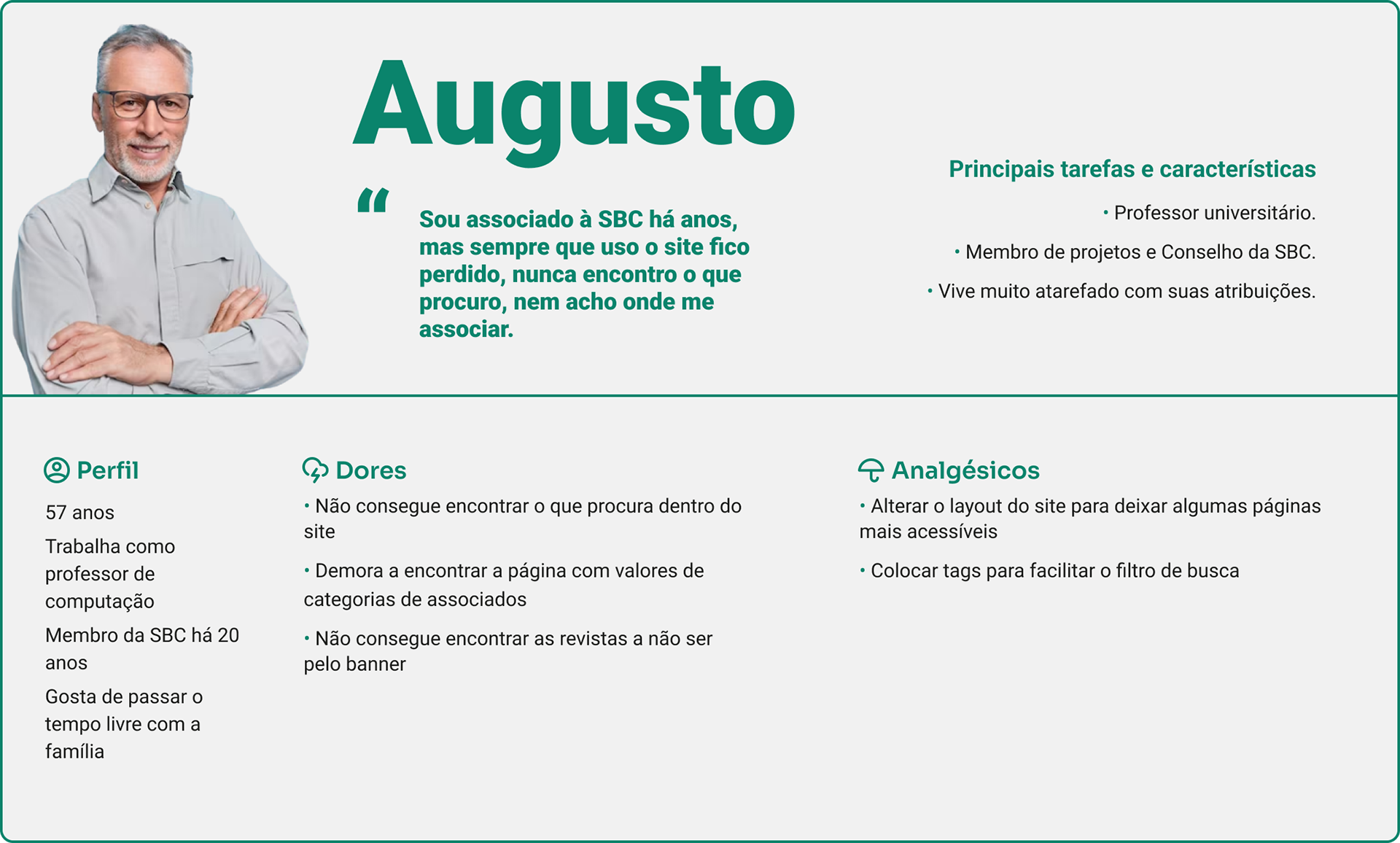
Persona - Augusto
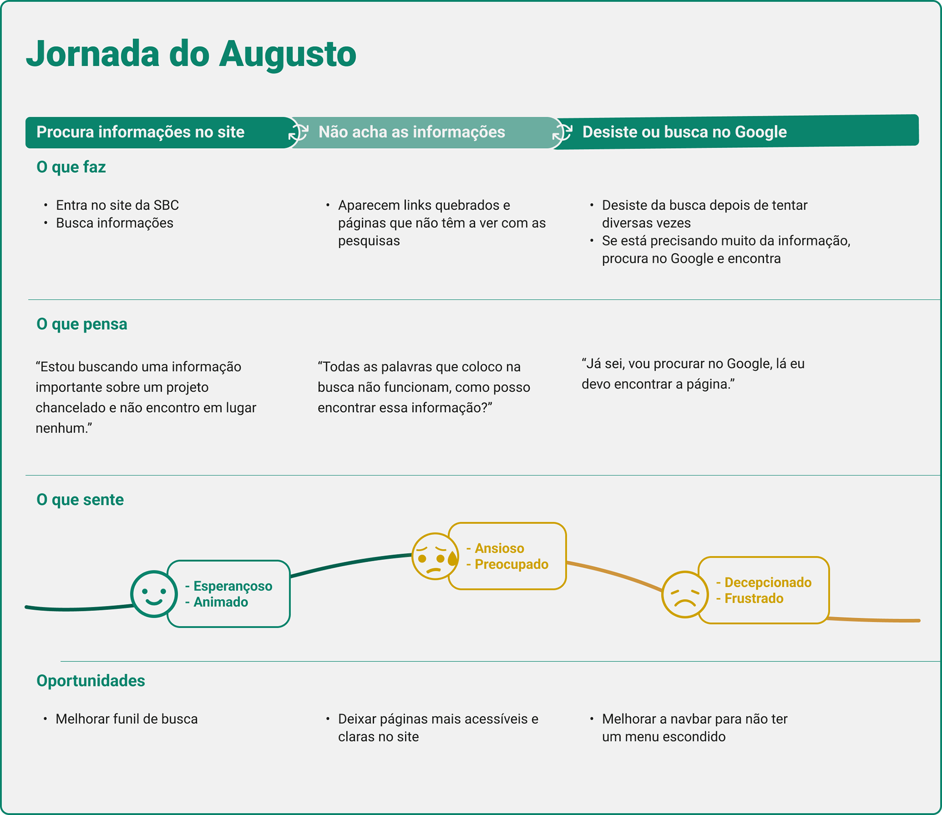
User's Journey - Augusto
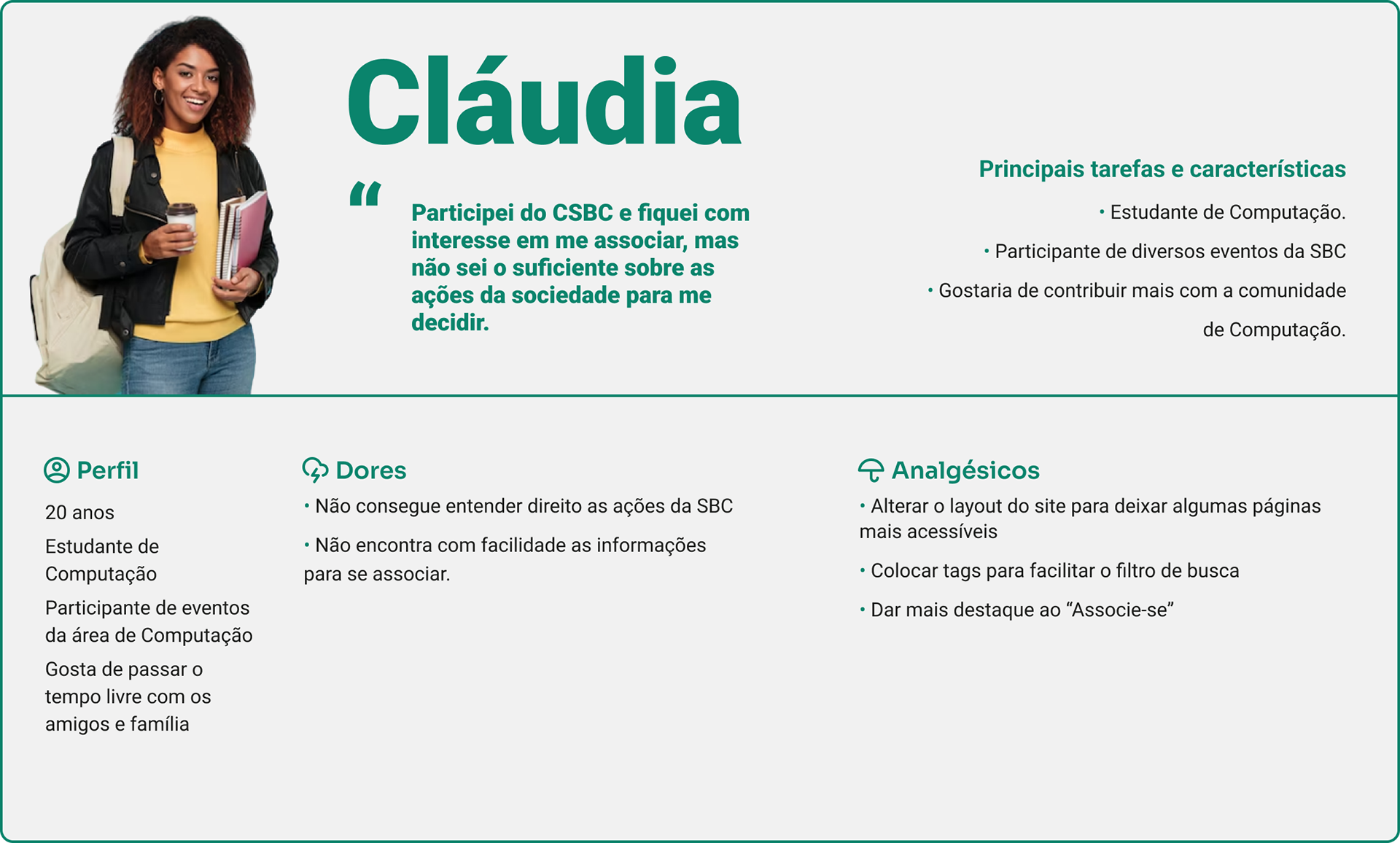
Persona - Cláudia
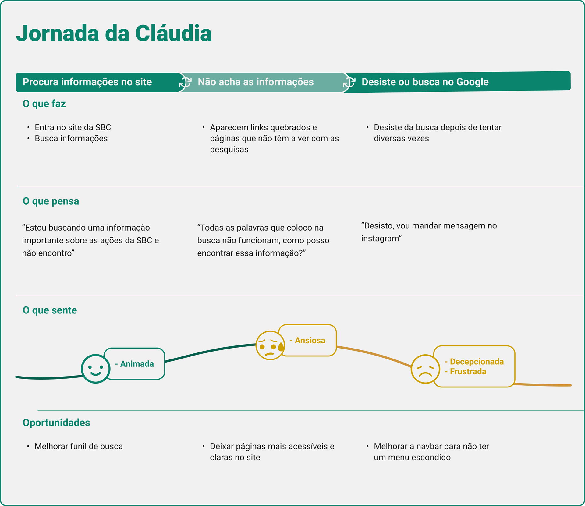
User's Journey - Cláudia
Validation
I used the CSD Matrix to document the information discovered and prioritize solutions: what are the certainties, doubts, and suppositions? What should I prioritize? What are the hypotheses to be validated?
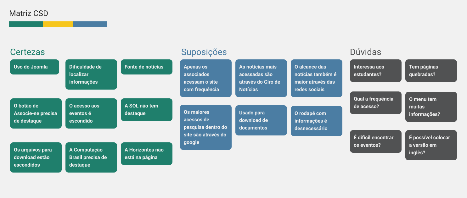
Matrix with the Certainties, Suppositions, and Doubts
Then, I prioritized the last two in an impact x knowledge matrix and was able to develop hypotheses to continue with the research.
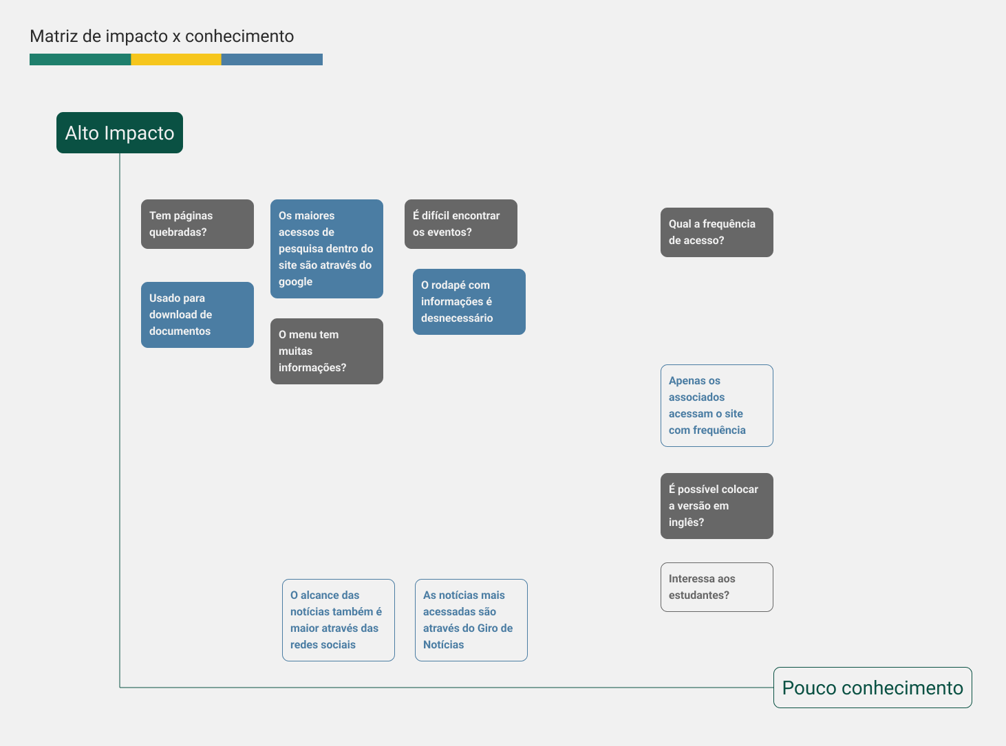
Higher and left issues have a greater impact and knowledge
At this stage, I managed to talk to some people who use the site and I was able to better understand their pain.
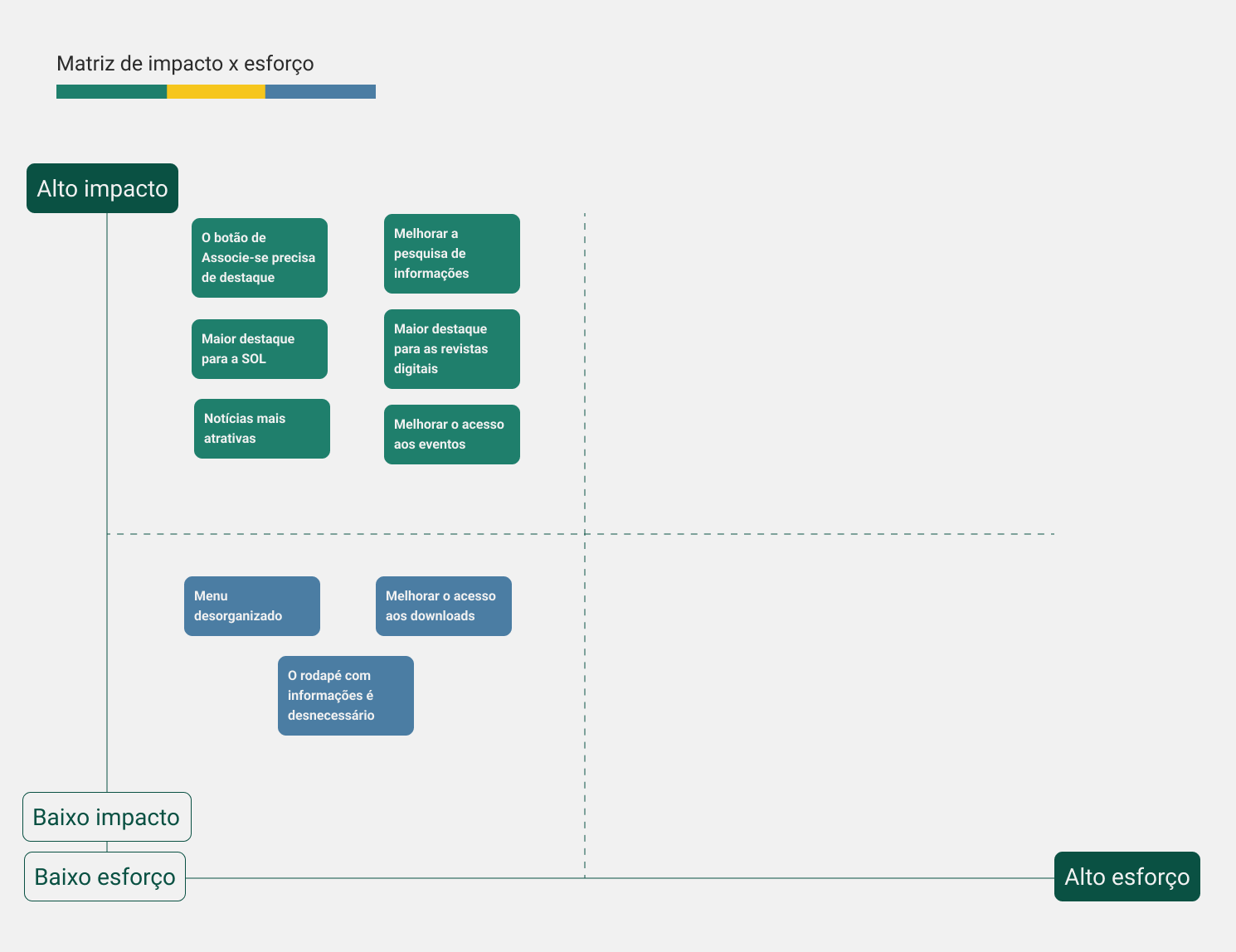
Solutions alternatives
After analyzing the matrices and interviews, I carried out the impact x effort matrix to understand where to start. My priorities are in green.
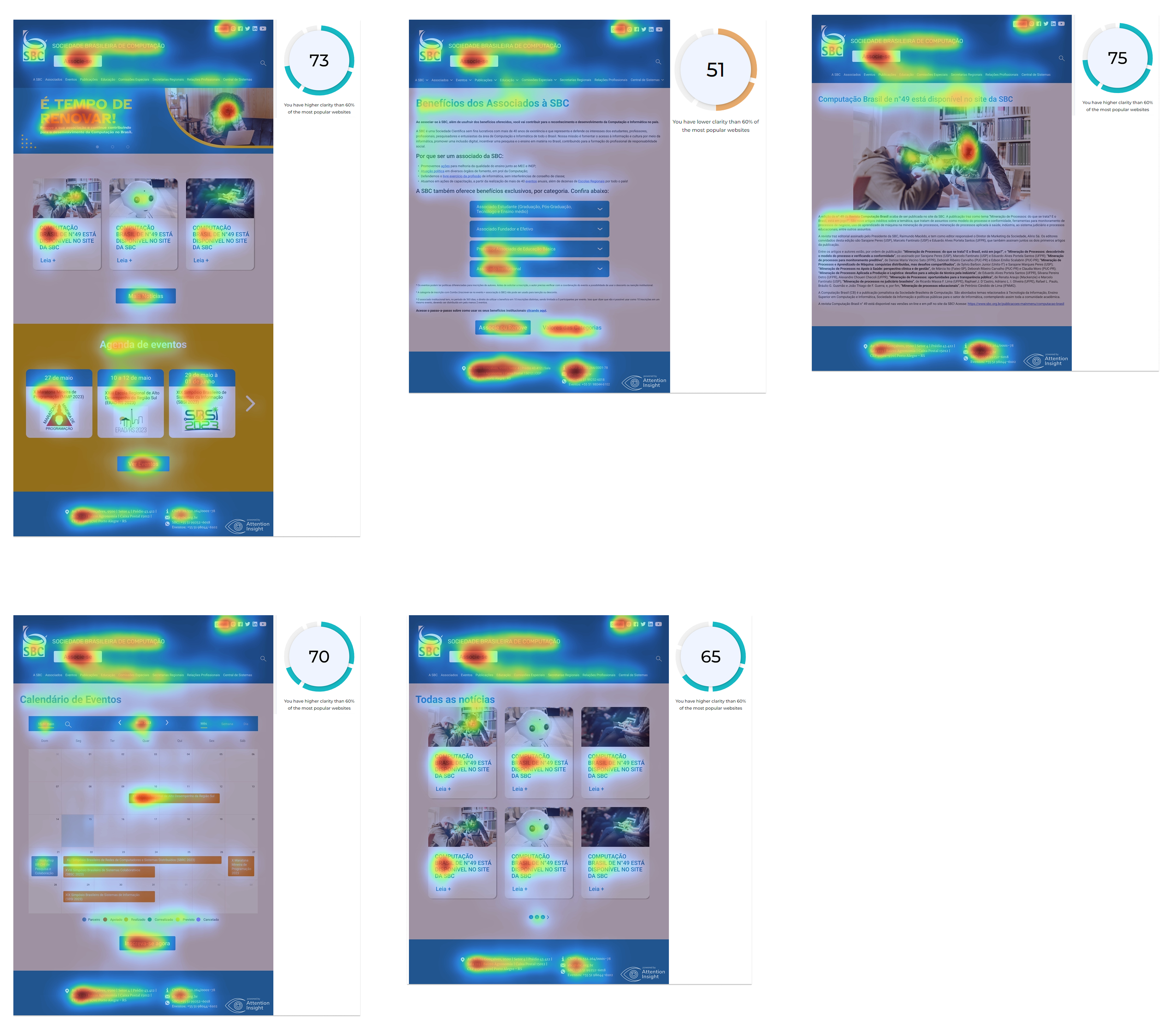
I also used the Attention Insight plugin in Figma to apply the heat map to the main pages of the site.
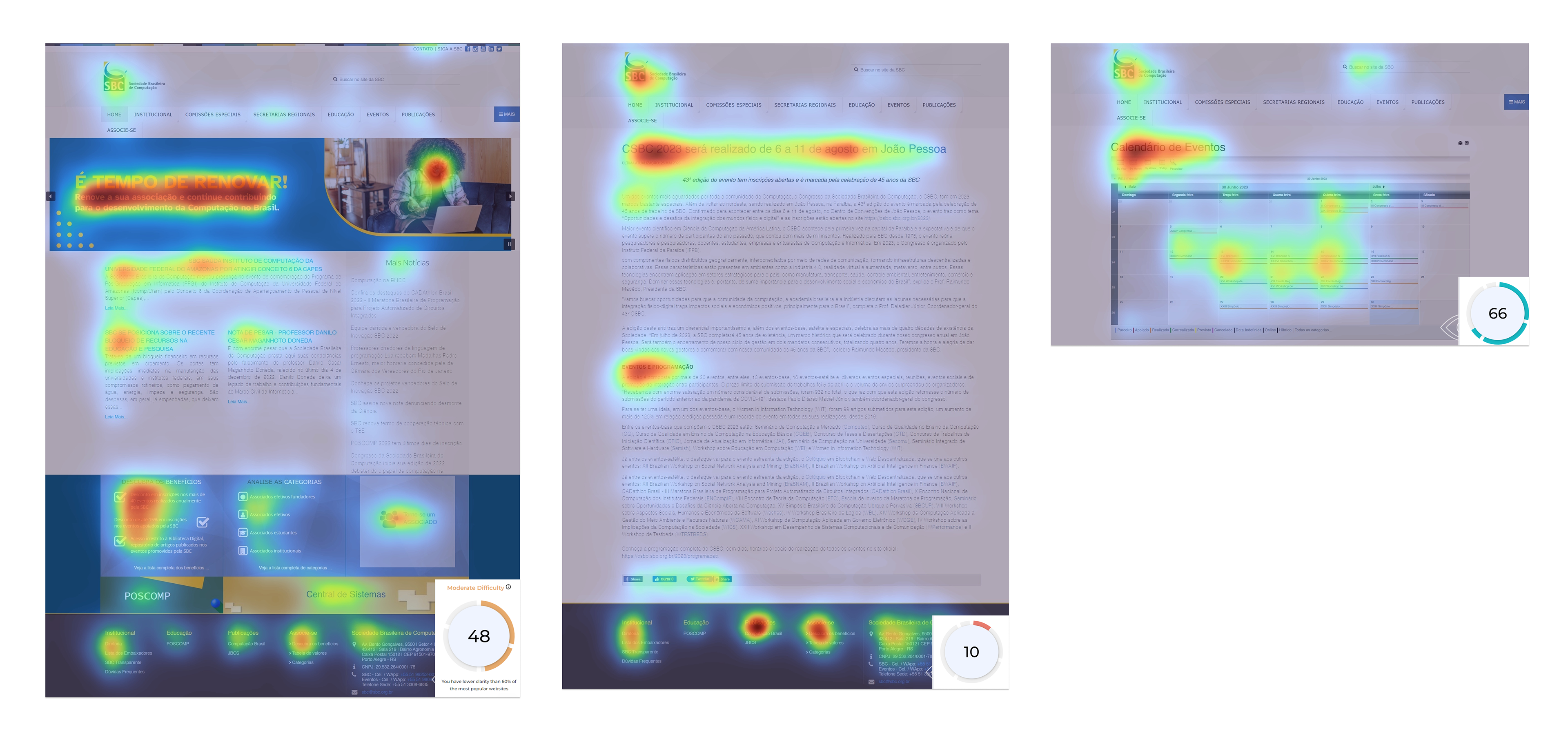
Homepage heatmap, news page, and events calendar. The plugin gave the clarity percentage of each page
The plugin showed that the areas that most attract attention on the website were the banner and the footer. It also gave the percentage of clarity and understanding of the page, with the news page, with the largest amount of text, having the lowest percentage. The events calendar itself (image 3) did not draw enough attention to users.
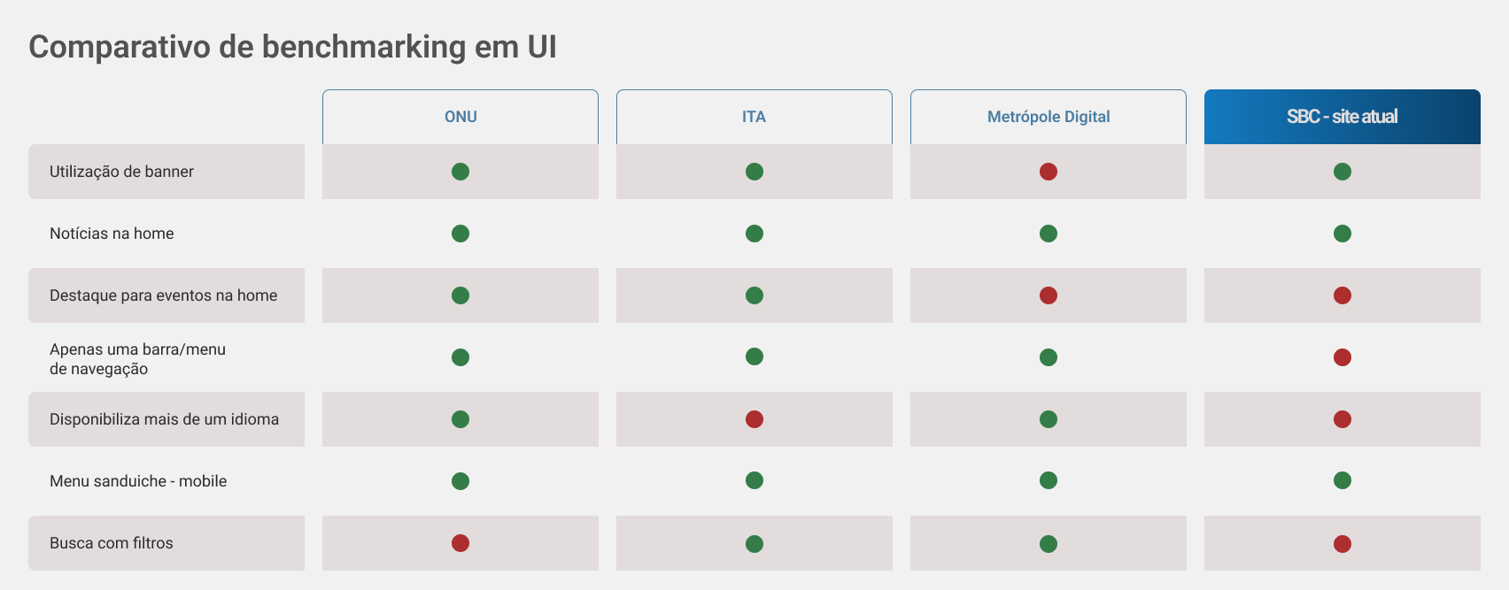
Benchmarking
As BCS has no competition, I decided to do UI benchmarking and analyze some other institutions that could be a reference for the Society's new website.
Solutions development
When I started thinking about the solution, I used the “crazy 8” method, in which I made 8 sketches of how I would redesign the product. After that, I started with the wireframes.
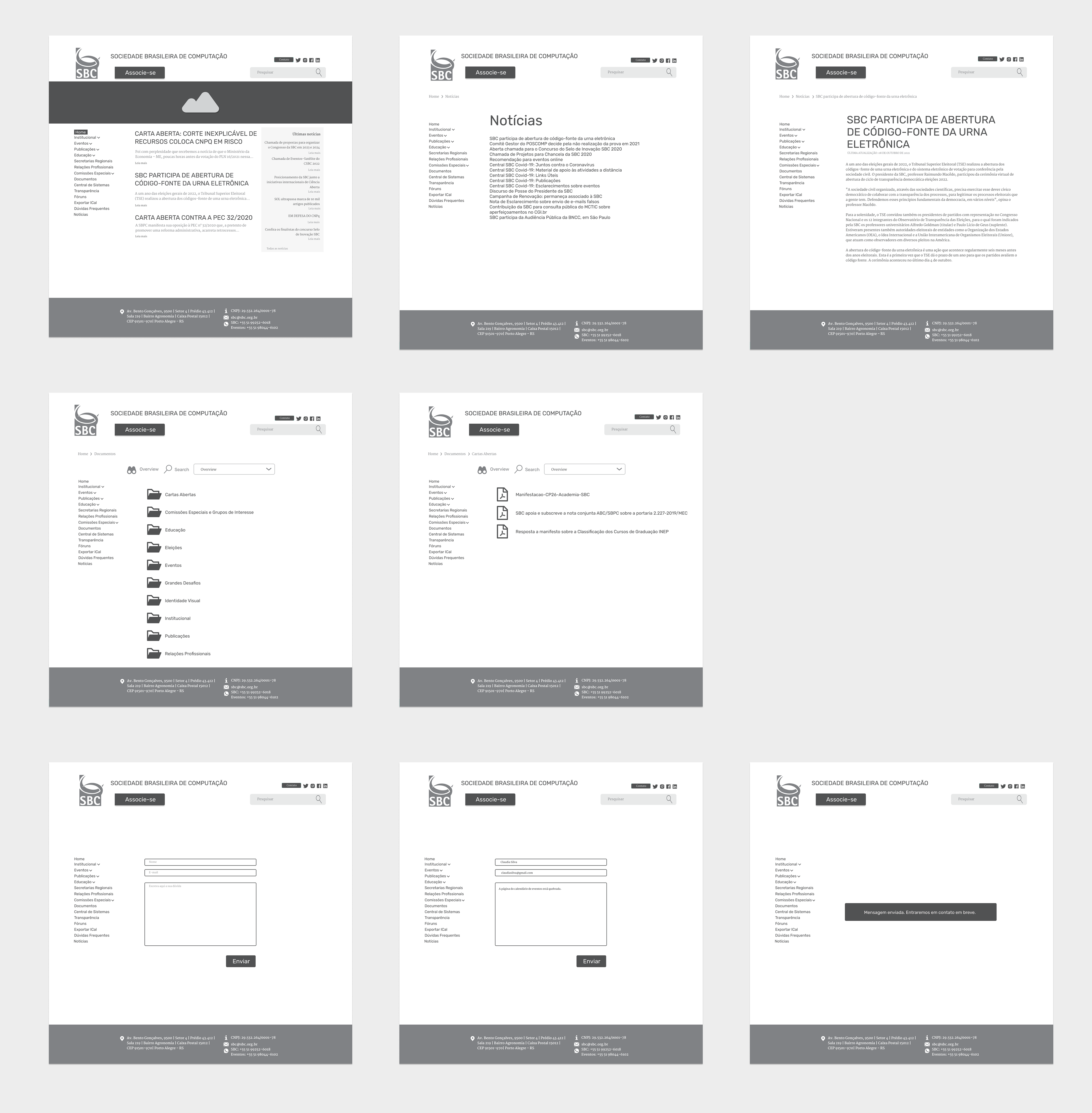
Wireframes Web
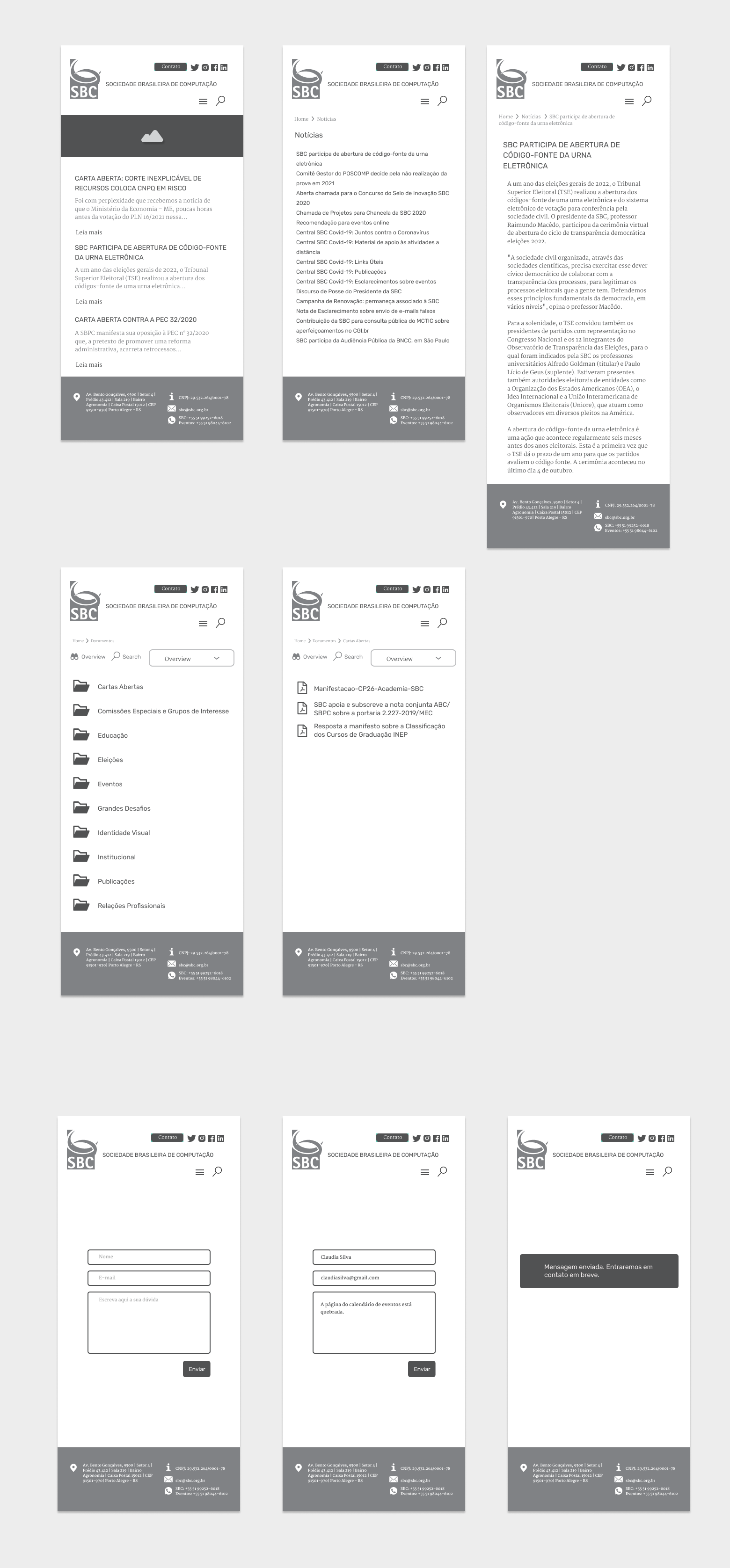
Wireframes Mobile
Due to the short deadline for delivering the prototype, after the wireframes, I moved on to building the high fidelity.
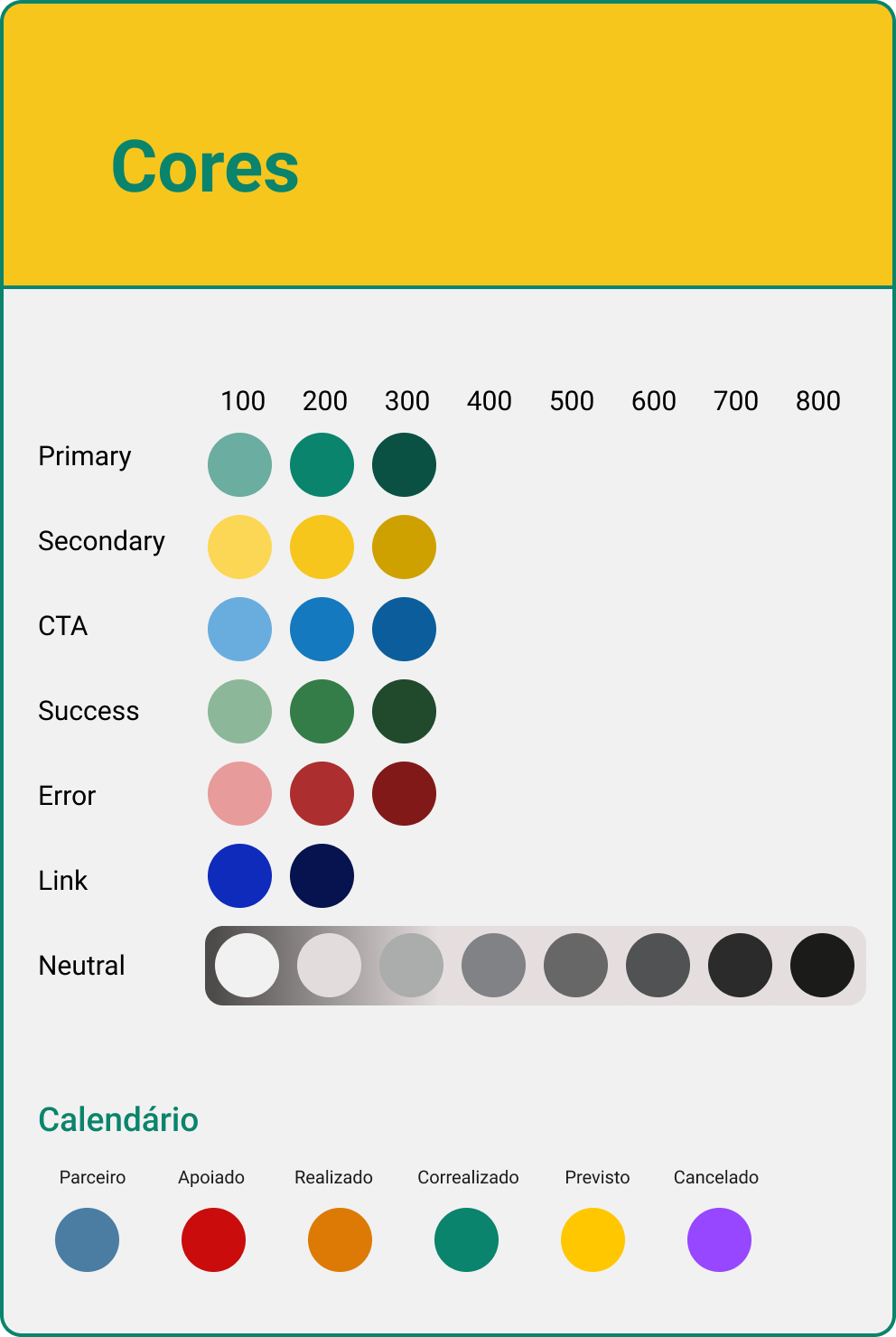
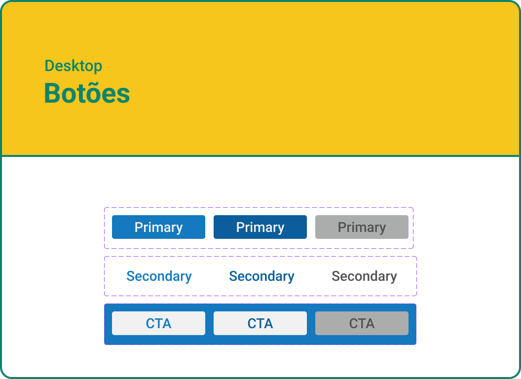
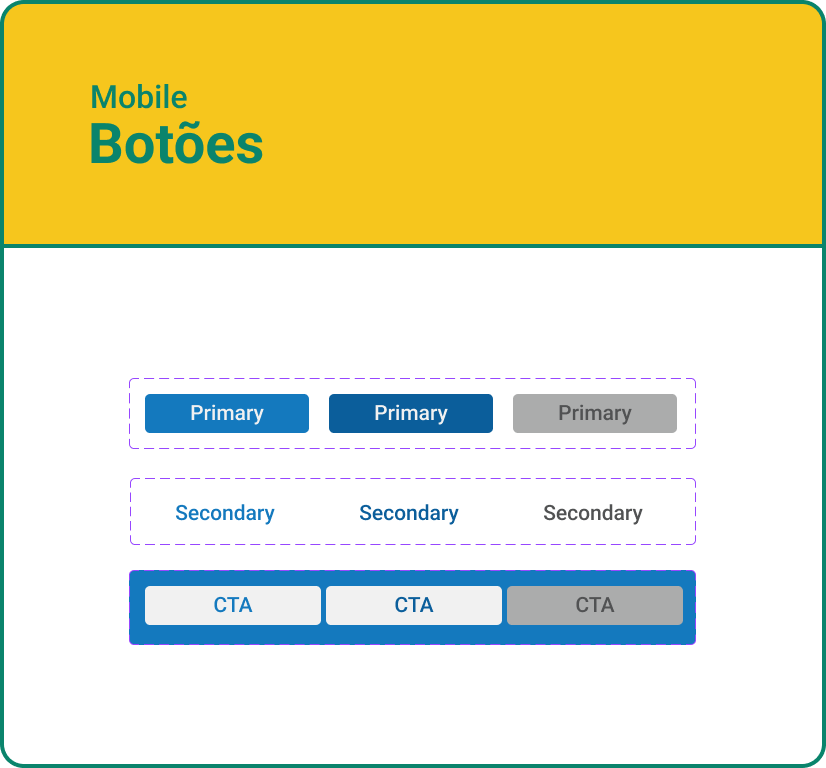
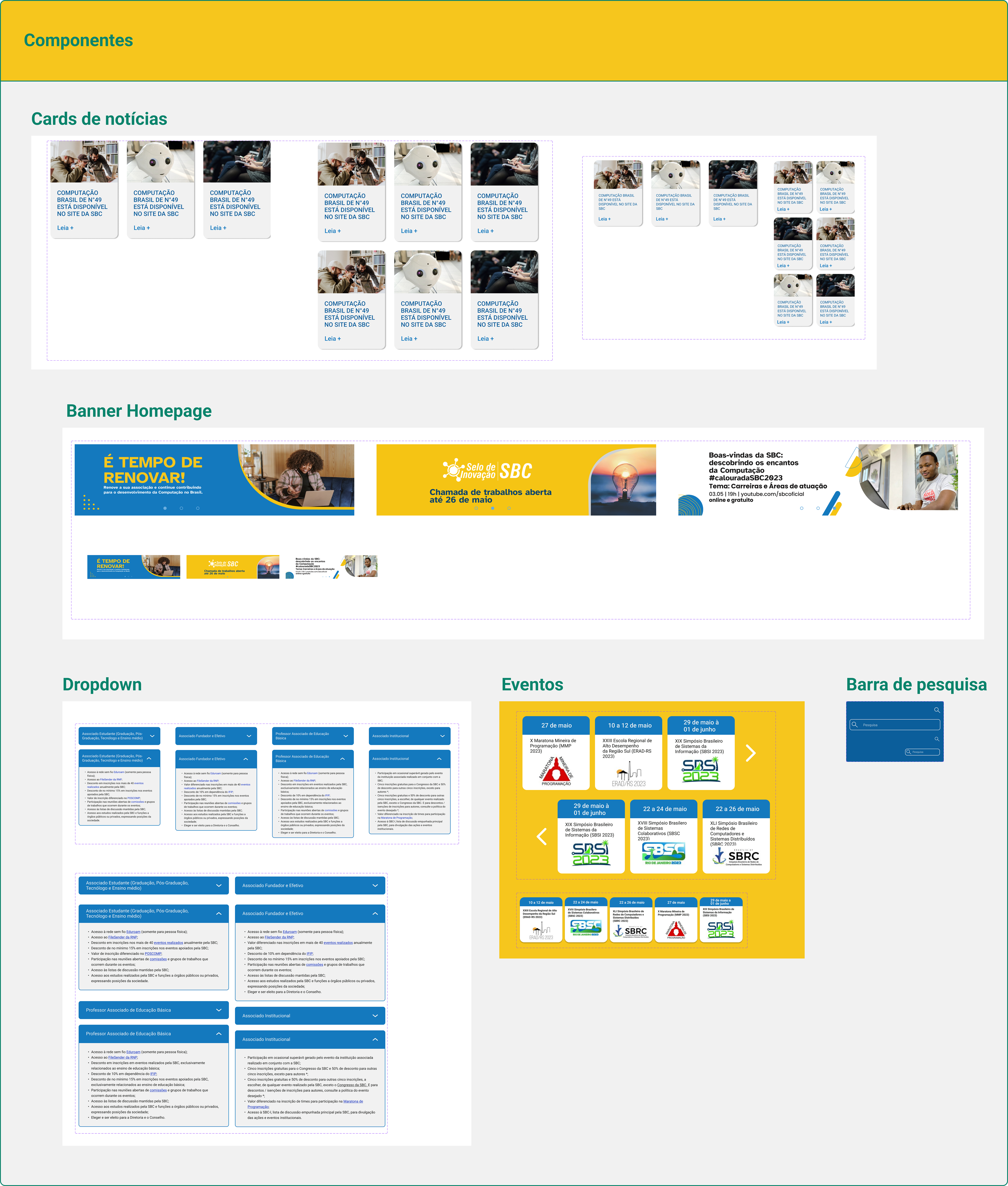
Design System
I used the brand's logo and the Brand Guidelines as a basis, and from these colors, I developed the website's Design System.
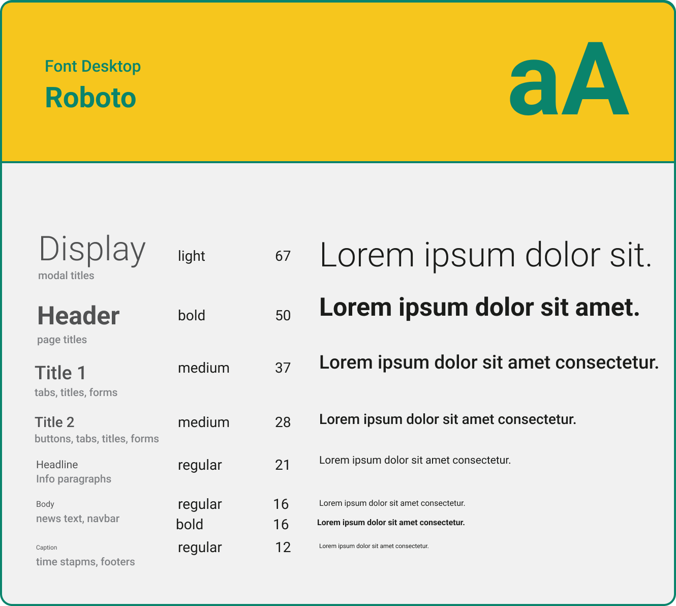
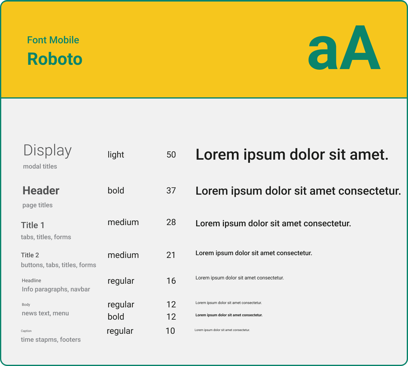
For the font, I chose Roboto because it is easy to upload to the web and has several variations, it is also a more serious font that conveys confidence.
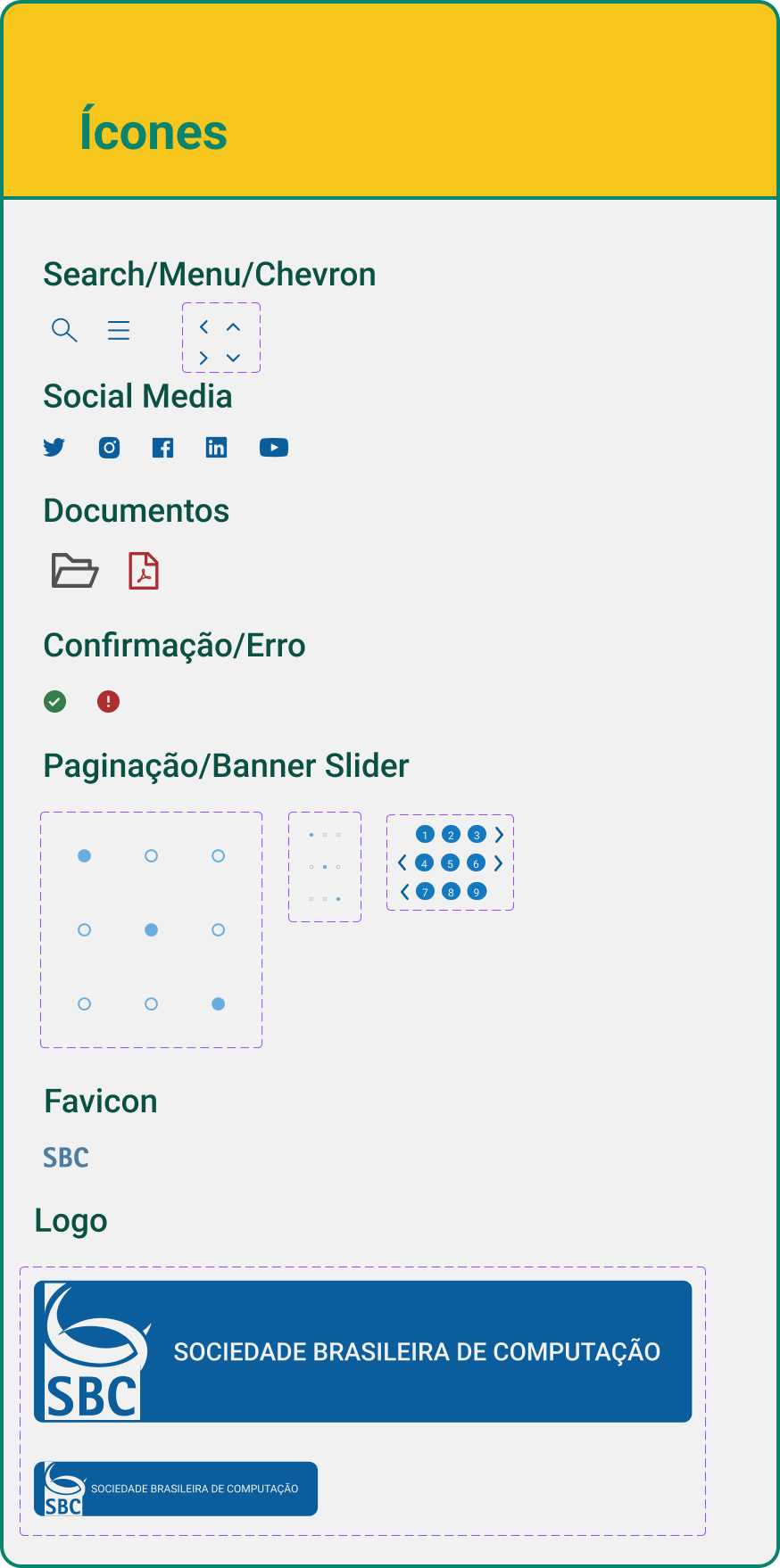
I took care to create the Favicon too, using only the letters from the logo since space is limited. Leaving something more modern than the current one.
High Fidelity
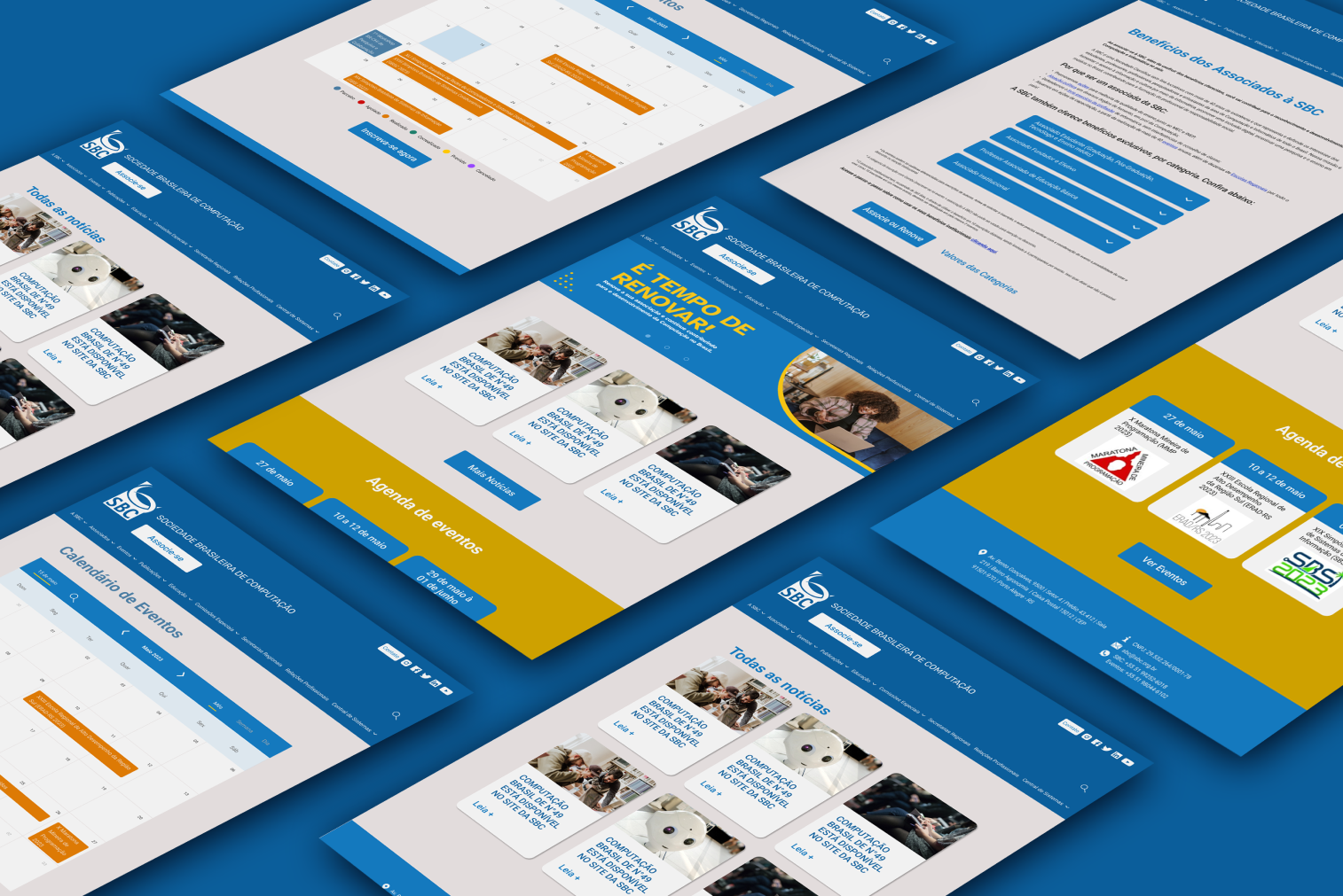
At this point, I had already mapped the main points for improvement of the site and was able to create both desktop and mobile screens. The objective was to create a prototype ready for testing and thus validate some of the main changes.
They would be:
• Renewal/New Association;
• Access to events;
• Access to the organization's documents;
• Contact page for comments/complaints.
• Renewal/New Association;
• Access to events;
• Access to the organization's documents;
• Contact page for comments/complaints.
Testing the prototype
For the tests I selected 5 different profiles, 2 of whom were users of the BCS website, 2 computer professionals who had never used the site, and a layperson who had never accessed the page either.
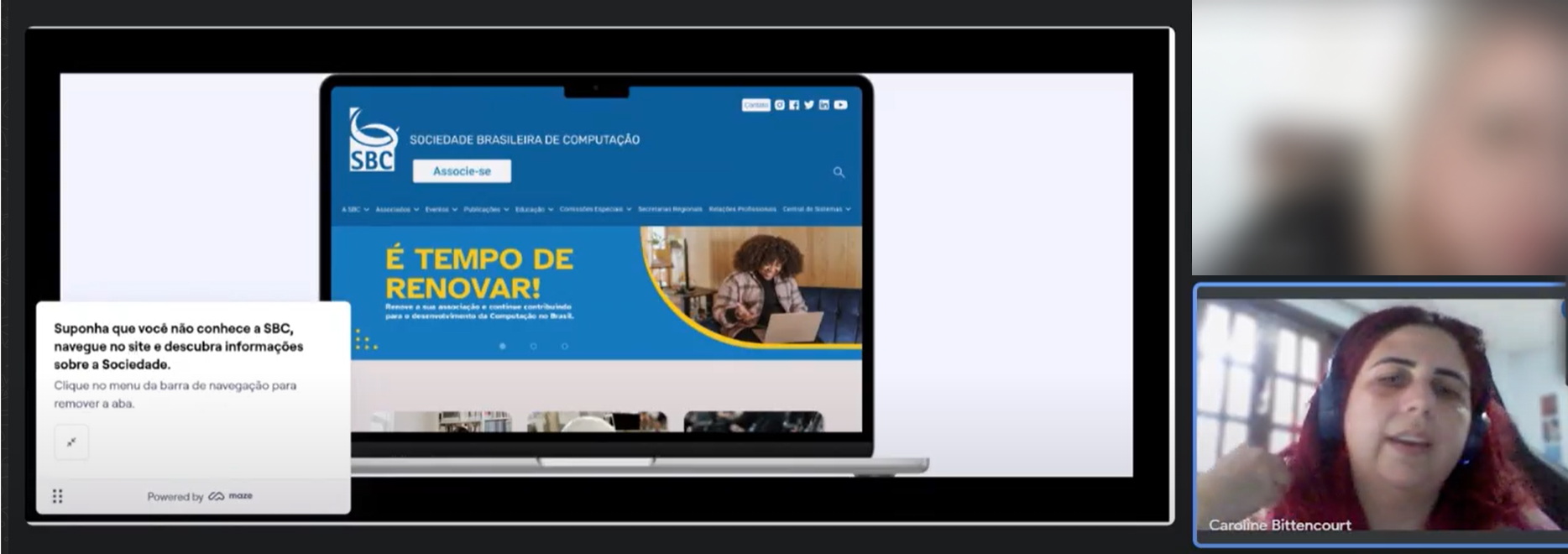
Test carried out on Maze
In the test, I used the Maze platform, and I noticed that even though we had events on the home page, most people searched for events directly in the menu. With this, I adjusted the events menu so that access to event registration was clearer, making this path easier.
The highlighted Join button proved to be very effective, as did document access, which on the previous website was in a hidden menu. I also inserted a dropdown on the Benefits page to make it more dynamic and attractive.
Finalizando o produto
Finally, I ran the heatmap plugin again to compare the new pages with the old ones.
With this result and validation of the tests, the website was sent to development and is in production.
Next pages